Agent OS

Re-thinking the call center agent experience.
Role
Product Designer
Prototyper
Length
2021-2022
Form
Desktop App
Responsive Web
Collaborators
Product, Business, Research, Content Design, Accessibility, Development

Brief

I was brought onto Charter Communications to help bring a new and improved interface for thousands of call center agents across the country. As a product designer, I created designs that were user-centered, highly usable and personable. Prototyping and research was a key part of the process, and I was additionally tasked with creating realistic, extremely detailed prototypes that drove our user testing.

Our product, called 'Agent OS,' was overwhelmingly given positive sentiments by users, with the general sentiment that it would help them resolve calls faster than if they had done it with the legacy product. We reduced their reliance on third-party software and also increased user satisfaction and streamlined workflows.

Advocacy for people with disabilities was at the forefront, as we incorporated accessibility reviews and designs that were not only screen-reader friendly, but also passed at minimum AA (in most cases AAA) contrast  guidelines. Later, we incorporated our design guidelines into a design system called 'Fidget,' a UI library that remains in use to this day by various agencies across Charter.

Opportunity

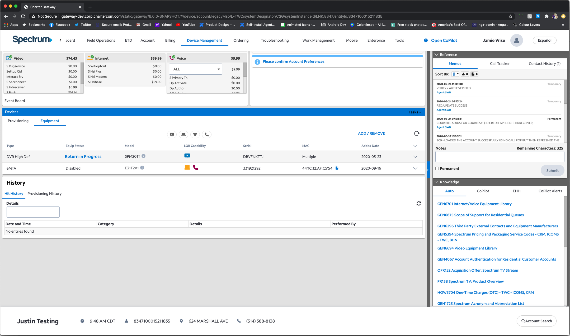
Internal tools are generally a neglected part of the design space. It is not flashy and aesthetically pleasing like new, modern interfaces. It often has many challenges and limitations that include obsolete or limited data, traditional workflows, and feature creep. Our agents previously used three different legacy systems from various acquisitions, each one increasing in complexity. For call center agents at Spectrum, it was an uphill battle to find simple information for the customers that called them.
Gateway, the previous design.
Our team came up with a simple solution: land the agents on the page they need to resolve the call. When customers call into Spectrum, they are asked a few questions via an interactive voice response (IVR) system. Using this, we can anticipate what the customer is having issues with and serve up a solution to agents accordingly—these pages were called 'call reasons,' and was the basis of our design for the entirety of the project.

Process

A sneak peek into our process: creating a shared goal with stakeholders, designers, and developers.
Each call reason was designed via The Design Sprint created by Google Ventures, incorporating our business partners, stakeholders and developers into our creative process. In doing this, we were able to quickly create and design a product that was both feasible and usable. We then tested with real agents, and once these findings were established by our researchers, we were able to refine our designs and hand them off to development.

With our process, we were able to design for over 20+ call reasons and additionally provide designs for other flows, encompassing the entire agent experience.
We used Axure RP to rapidly prototype and test our designs, which was my primary responsibility for the bulk of this project. With this software, we were able to verify every detail and data point with researchers and subject-material experts, and also did test-runs to ensure that no stone was left unturned. In truth, it was an extremely laborious process that included late nights, but it was worth it every time.
We also wanted to go above and beyond to champion accessibility for our designs. Every designer working on Agent OS was trained on accessibility. In our designs, we incorporated AA contrast (at minimum), screen-reader friendly layouts, and also color-blind and dark modes. Additionally, we also collaborated with our accessibility team to review our designs.

We even went so far as to conduct a design sprint centered around agents with disabilities. We tested with agents who were sight-impaired and created a prototype that was fully accessible by keyboard, as well as screen readable.

Design

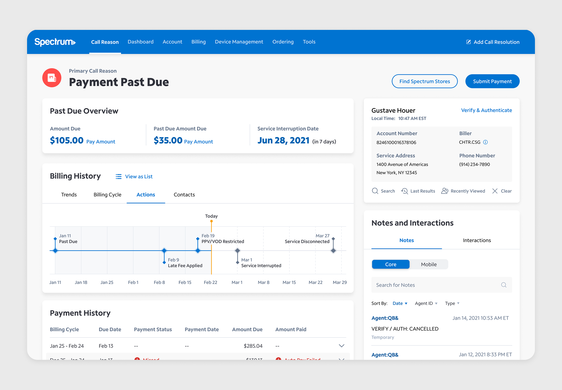
With our process, we were able to design for over 20+ call reasons and additionally provide design support for other parts of the agent experience. Here, I'll highlight some designs that were especially well-received by agents after pilot.
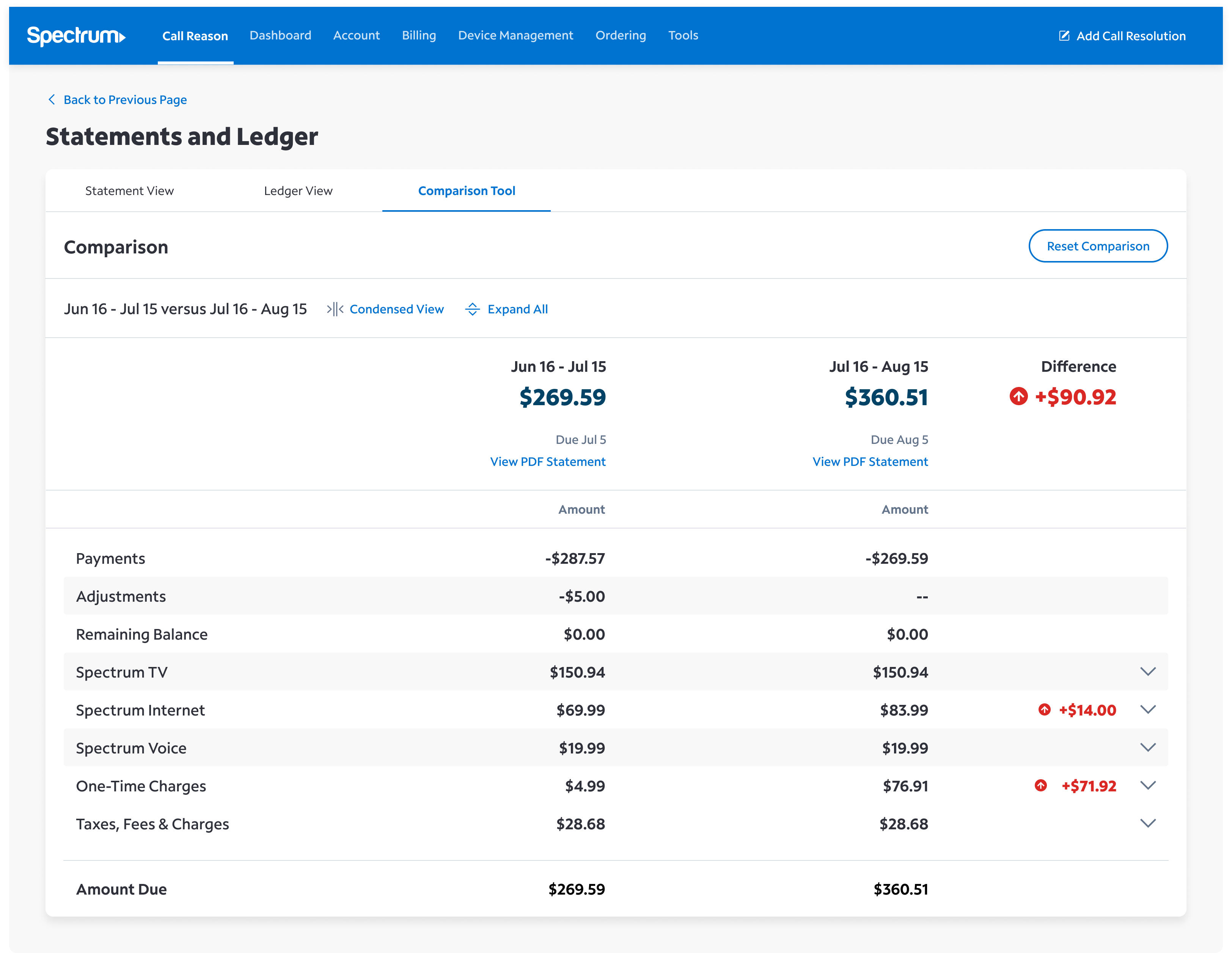
Bill Comparison
When customers call in, they often have questions about the pricing of their plans. Sometimes they accrue charges that they were not aware. Or sometimes a promotion has rolled off, causing their bill to go up in price. At the time, agents had to comb through copies of PDF statements that the customer had also received. This took up a lot of time and effort, especially while on a call with a potentially irate customer. To fix this, we designed a bill comparison so that agents can see the differences between each bill month-to-month.
Statement comparison design
Anonymous quotes from agents during user testing.
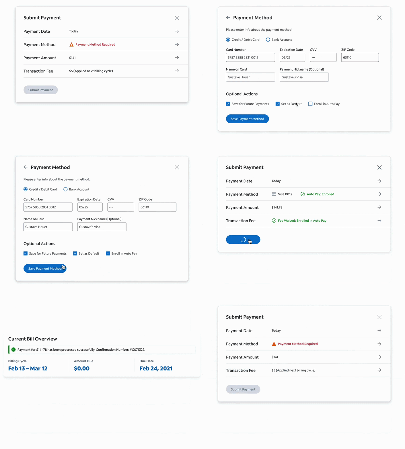
Take a Payment
On the prospective side, agents were able to send prospects their quote offers. Prospects could see how much their quote cost, with a breakdown of their services and details. This allowed the prospect to properly review and evaluate the value of our offer instead of having to call agents to ask about their quote. This will save time for both the prospective customer and the agent.
Take a payment modal flow
Theme Customization
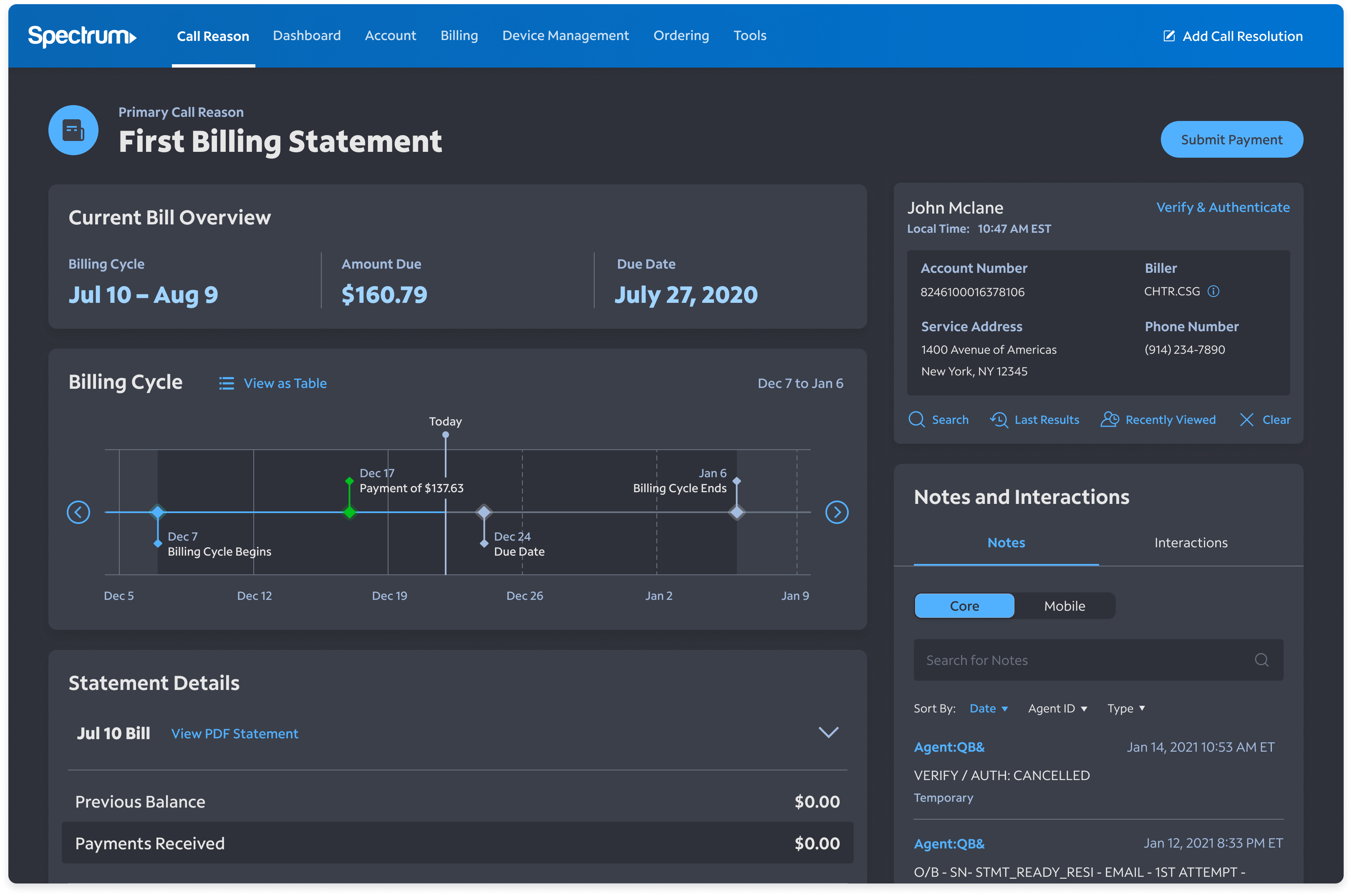
There are agents who work early in the morning and late at night, making it hard for them to use a screen that had a bright white background. Not only that, but there were agents who had visual impairments and needed a design that was a far higher contrast than what we could provide.

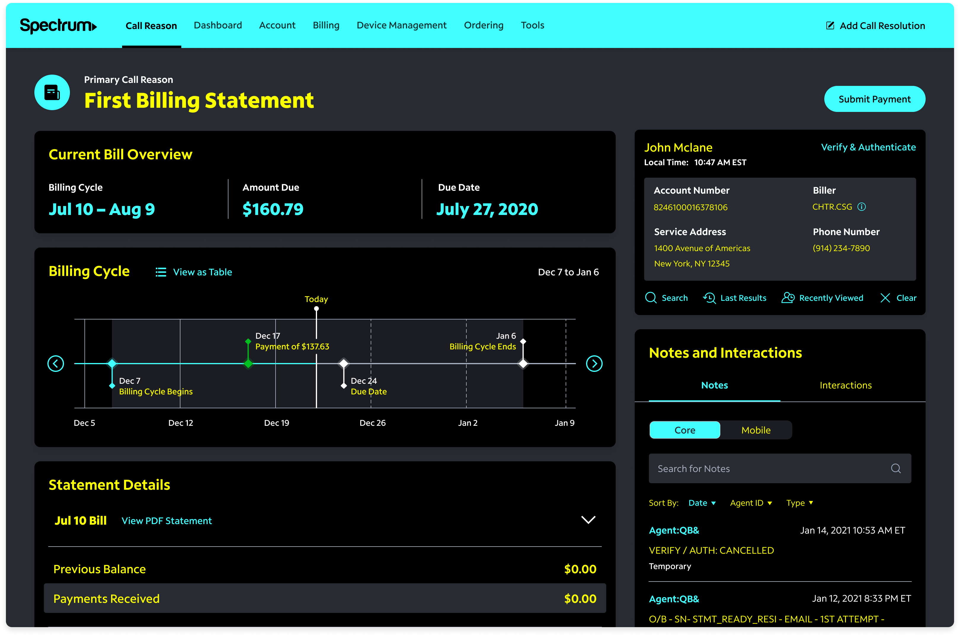
We provided them with the ability to customize their UI to best fit their needs. Our team also collaborated closely with development during this process, allowing us to handoff and pilot our designs quickly. During testing, both dark mode and also high contrast designs (with keyboard-only controls) were received well by our users.
Dark mode for the call reason 'First Billing Statement'
High contrast mode for the call reason 'First Billing Statement'

Conclusion

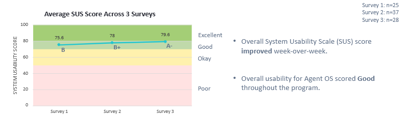
This project was released to our users on a rolling basis by call reason starting in 2021. To get a wide range of data, our researchers released surveys and conducted focus groups with various agents throughout the country. We measured usability with the system usability score (SUS), as well as asking questions about overall satisfaction, feedback, and other useful data.
A picture of one of the SUS surveys for one of our call reasons, 'Outages'.
As you can see, our product scored good, but not perfect. However, the average score improved week-over-week, which indicates that the perception of our product improved with time, and that agents could use additional training. We also had the opportunity to iterate on our call reason pages for issues that we weren't able to foresee, and to work with our users to make a product that was best for them.

Ultimately, I'm pretty happy and proud to have worked on Agent OS. If I were to go back and do anything different, I would definitely start technical exploration much earlier. While we had two versions of each product, 'Blue Sky' and 'MVP', I believe that if I had reached out to our developers earlier and asked technical questions, it would save us a lot of time and energy. Our designs were often limited by the data that we could procure, as well as the existing architecture of the product. We often had to balance the best user experience with realistic development timelines, and that was a valuable skill for me to learn.

Other work